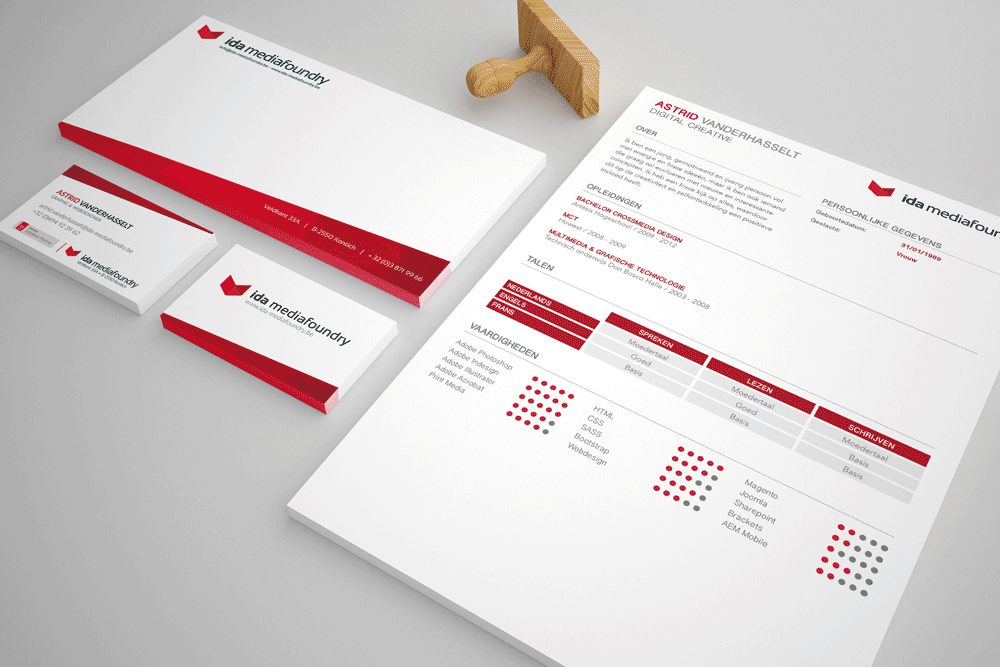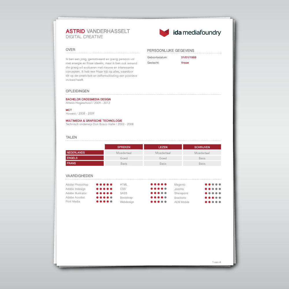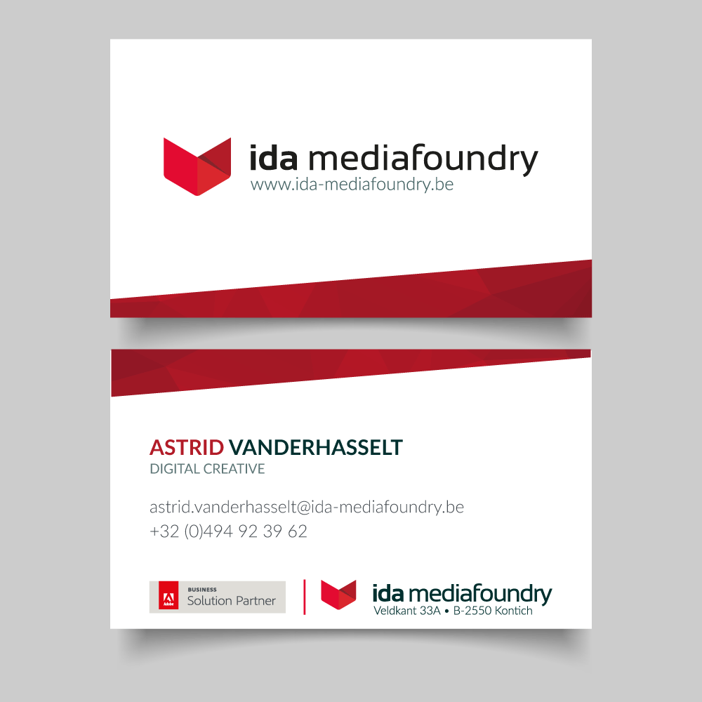


iDA Mediafoundry received a brand-new company logo that was completely different from the old logo. As such, it was important to replace the older business documents with a stylish and modern design that would fit the design of the new logo.
The new logo was used on name cards, envelopes and curriculum vitae. Because there are different tones of red in the logo, I had the idea to use red in the designs as well to make it more dynamic. I chose to keep the rest of the design more minimalist in order not to overdo the design.
Media Print Made for iDA Mediafoundry Tools Illustrator, Indesign
